Trends
[SAMPLE] 10 Examples of Good Architectural Lighting Design
February 03, 2021
Without lighting, architecture would probably not have the same impact. Whether it’s daylighting or artificial lighting, light draws attention to textures, colours, and forms of space, helping architecture achieve its true purpose.
Lighting affects how we enjoy architecture, and illumination enhances the way we perceive architecture even more.
So, what makes some architectural lighting design good and others not so?
To strike a successful balance between lighting and architecture, it’s important to know three key aspects of architectural lighting: aesthetic, function, and efficiency. The aesthetic is where designers and architects focus on the emotional impact the balance of lighting and architecture will have on occupants. It’s where designers determine how they want people to feel when they walk around a space. This aspect is especially important for retail locations; exterior lighting should draw the consumer in, and the interior lighting should awe them as they walk through the doors in addition to showing off the product.
The second aspect, function, cannot be overlooked. While we want the lighting to look a certain way, we have to also make sure it serves its most important purpose – to enhance visibility. Areas should be illuminated so that occupants will feel safe when navigating a room or entire building. They should be able to see the floor and walls around them, which should create a feeling of reassurance.
The final aspect is very important in today’s age of green building and sustainability movements. It’s one thing to create a breathtaking lighting layout, but it’s another to create a breathtaking layout that is also incredibly energy efficient. This can be done by assuring the majority of the light is reaching its target and there is less wasted light. Reducing the amount of wasted light will make the building more efficient. LEDs have already been known worldwide as a sustainable lamp source as compared to the conventional types. Due to technology, LEDs have constantly evolved, gradually improving its luminance level for lesser power output, to save energy is to save money.
Here are some examples of excellent architecture complimented with good architectural lighting design:
1. Indian Heritage Centre, SG
The four-storey Indian Heritage Centre building is an iconic, unique and sustainable building that blends both traditional Indian as well as modern architectural elements. The architectural design for the facade is inspired by the baoli (or Indian stepwell) and seeks to create an urban forum for the celebration and appreciation of Indian culture.
The building houses five permanent galleries, a museum shop as well as programming and activity spaces. The diversity and multi-faceted nature of Indian culture are also captured in the use of a translucent shimmering façade to create an impression of the Centre as a “shining jewel” in the day, and the transformation into a “glowing lantern” of the Indian community with the lighting of the colourful façade mural at night.


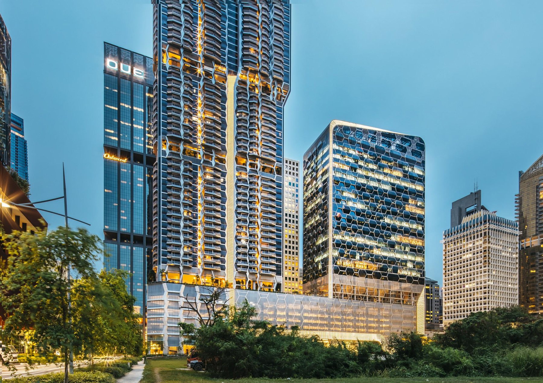
2. V on Shenton, SG
Set in the rejuvenated heart of the financial district, V ON SHENTON is the ideal base for city living. Connected by clusters of modern amenities, the city is your backyard that extends into a convivial neighbourhood. Daily commuting, a stroll to a nearby café or a quick trip to the boutique grocer all become occasions brimming with lifestyle opportunities. What is metropolitan living if not being in the centre of it all?3. Trinity Christian Centre, SG
In a prominent intersection on the outskirts of Singapore, in an area called Paya Lebar, stands Trinity Christian Centre. Designed to resemble the vast canyons of the Israeli deserts, the building’s beige-coloured facade suggests the folds of the dramatic landscape. The church’s original lighting design did not live up to Trinity’s goal of becoming an illuminated landmark. At night, the lights at the gas station next door were brighter and had more of an impact. In response, the church commissioned ONG&ONG to design and implement a new lighting concept.Inspired by the original desert geography concept, ONG&ONG wanted to use lighting that matched the palette of the Israeli sky while communicating meaningful stories to the community.


4. Ofunato Civic Centre and Library, Japan
Located in Ofunato, a town on the distinctive Sanriku Kaigan coastline of Iwate prefecture in northeastern Japan, Ofunato Civic Center and Library is a cultural building complex which consists of the main hall with 1100 seats, a library, multi-purpose spaces, an atelier, a tea room, and a studio. In its development, regional workshops and fieldwork have been organized by more than 50 times to make communication among architects, local residents and public officers.Consumers: fickle, relentless and unforgiving.
Nokia failed despite its pole position in the mobile market. The company, unfortunately, did not welcome the winds of change, and succumbed to the rise of the smartphone. There was a period of mourning, but also a learning point for the rest of the world.
Disruption may appear to be anathema to productivity, but the inverse is true relative to innovation; the act of identifying the problems of consumers, creating a new market and then displacing current structures, products and services actually raise overall productivity levels.
Disruptive innovation has been altering the way we live since the 1500s — the Spice Trade was disrupted by Frederick “Ice King” Tudor’s Insulated Ice Warehouses. The Fridge disrupted this ice-cutting industry, and today, the domestic fridge is ubiquitous. But the telephone timeline might be more relevant to us: from Graham Bell/Elisha Grey’s invention to the cordless phone in 1965, Motorola’s wireless phone in 1973, Blackberry’s email capability stir in 1999, Nokia’s 3310 during the jubilee year and at last, the iPhone in 2007.